Building myScheduler didn’t start with inspiration. It started with mild academic panic.
One evening, I found myself juggling five different apps just to answer a very simple question: “Do I have class tomorrow, and how screwed am I if I skip it?” My timetable lived in one app, attendance in another, exam schedules were buried inside a PDF that looked like it hadn’t been redesigned since 2007, and any actual communication was scattered across group chats that somehow never contained the one message I needed.
At some point, it stopped being inefficient and started feeling intentional—like the system was designed to make sure you always missed something important.
So I did what any reasonable person would do. Instead of fixing my habits, I decided to build an entire app.
What is it?
myScheduler is what happens when frustration meets just enough technical skill to be dangerous.
It’s a mobile app built with Flutter, designed to consolidate everything a college student pretends to stay on top of—timetables, attendance, exams, marks, and group chats—into one place. The premise is simple: log in once, tell the app who you are academically, and let it handle the parts you’ve been avoiding or forgetting.
The backend runs on Supabase, which is essentially the “I don’t want to manage servers but still want control” solution. It gives you PostgreSQL, authentication, storage, and real-time capabilities, all without forcing you to pretend you enjoy setting up infrastructure at 2 AM.
In theory, it’s clean, efficient, and helpful. In reality, it’s still a student app—just one that organizes chaos instead of eliminating it.
The screen
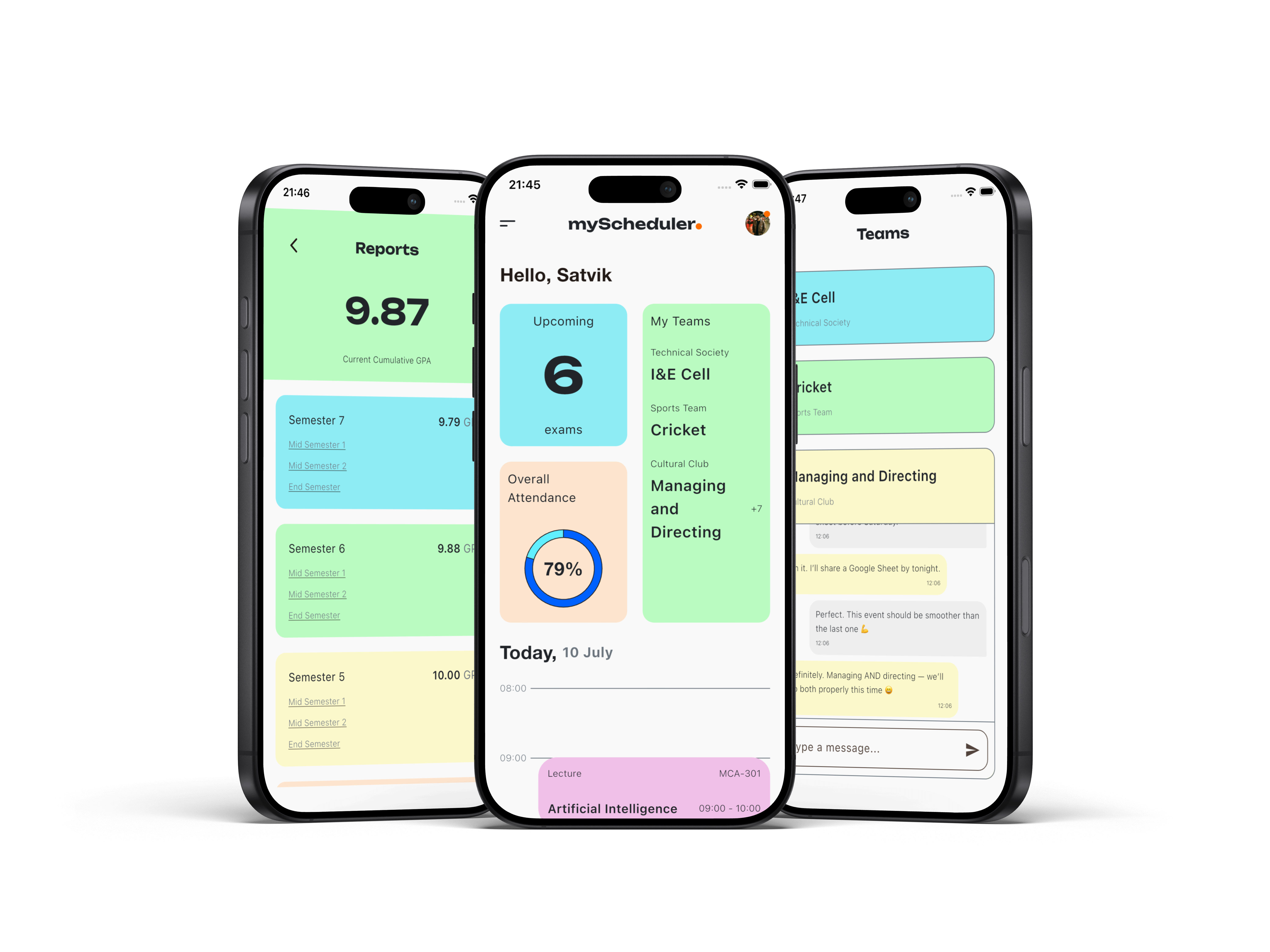
Home — your day at a glance
The home screen is where everything comes together, or at least where it attempts to.
At the top, there’s a greeting with your first name—because nothing says productivity like being personally addressed before being reminded of your responsibilities. Just below that sit three cards: upcoming exams (your future stress), attendance percentage (your current guilt), and your study group (a carefully balanced mix of support and distraction).
The real centerpiece, though, is the timeline. Instead of a simple list, the day is laid out as a vertically scaled schedule from 08:00 to 18:00, with each class positioned exactly where it belongs. It’s less about aesthetics and more about confrontation—you see your day as it actually exists, stretched out and impossible to ignore.
The screen loads automatically the moment you open the app, which is helpful in a slightly aggressive way. It removes your last excuse for not knowing what’s going on.
There’s also a hamburger menu. Not the perfectly symmetrical kind, but slightly off—because at some point you stop chasing perfection and start shipping features. It opens into a sidebar that leads to everything else, which is another way of saying it leads to more responsibilities.
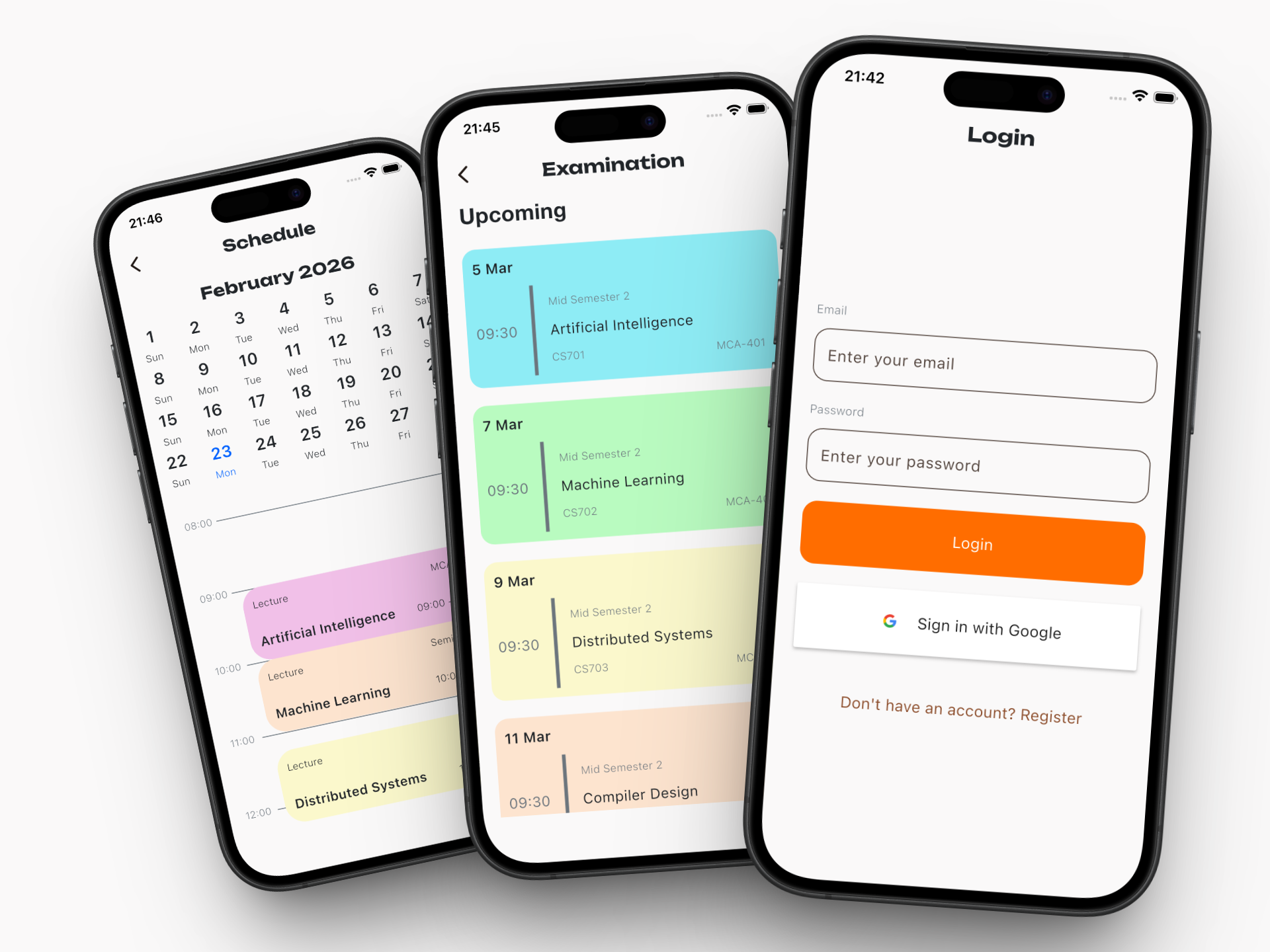
Timetable — the illusion of control
This is the screen where you convince yourself you’re organized.
The timetable allows you to define your weekly schedule—subjects, timings, rooms—arranged neatly in a grid that suggests your life is under control. And for a brief moment, it almost feels true.
Adding and editing classes is straightforward, intentionally so. The goal isn’t to make you think, it’s to make you input data quickly enough that you don’t abandon the process halfway through. Of course, the timetable assumes your week will go as planned, which is an optimistic assumption at best.
Still, there’s something reassuring about seeing everything laid out clearly. Even if reality refuses to cooperate, at least the app does.
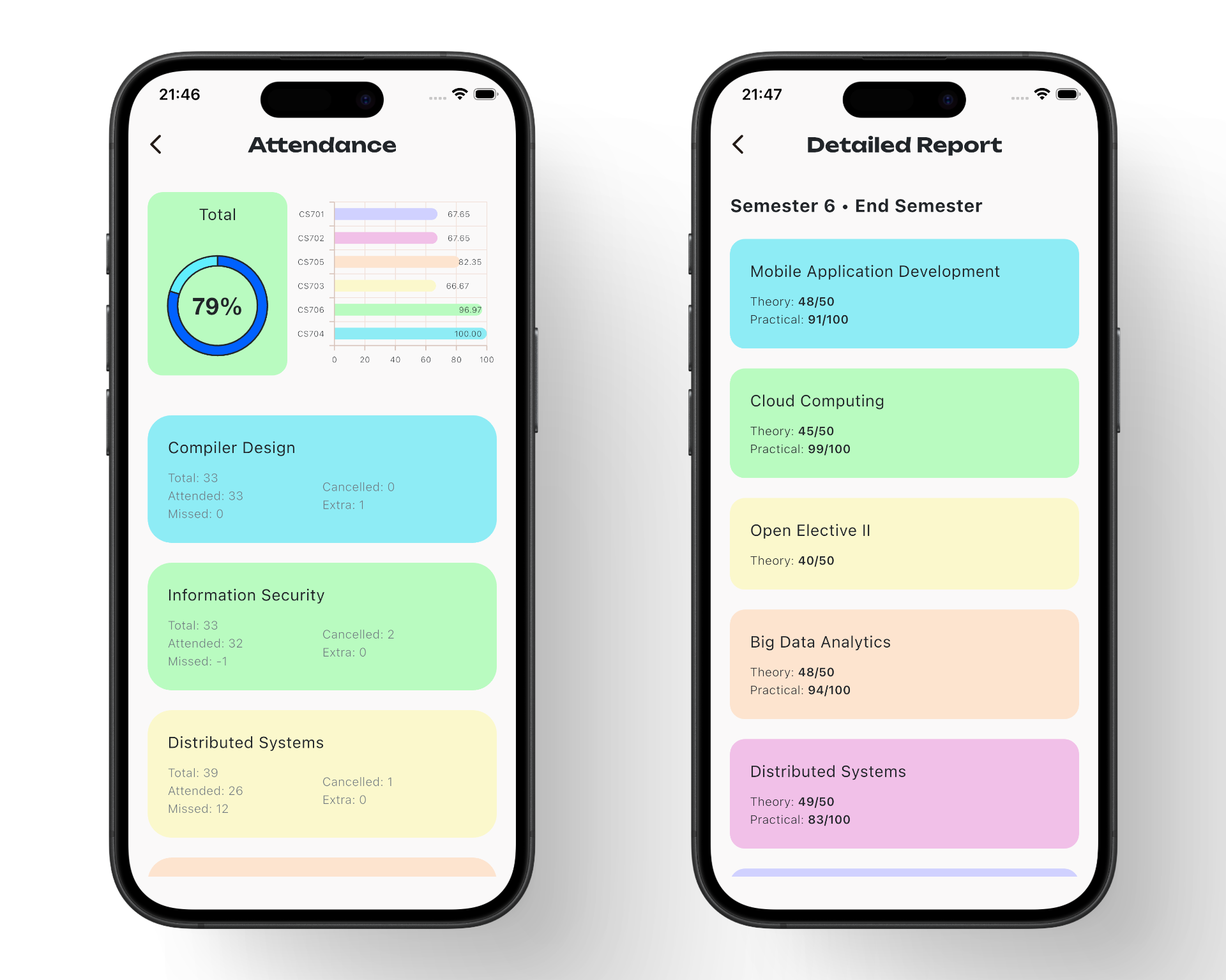
Attendance — quantified guilt
If any feature feels personal, it’s this one.
Attendance tracking takes something vague—“I’ve probably missed a few classes”—and turns it into a number you can’t argue with. Percentages, thresholds, and subtle visual indicators work together to show you exactly where you stand, whether you’re ready to see it or not.
There’s a particular kind of discomfort in watching that percentage drop after skipping what felt like a harmless lecture. The app doesn’t judge you; it just calculates how many more classes you can miss before things become a problem.
It’s quiet, precise, and completely unforgiving. Which, ironically, makes it one of the most useful parts of the app.
Exams — future anxiety, organized
Exams get their own screen, mostly because they tend to dominate everything else anyway.
This section lists upcoming exams in a clean, chronological format, showing dates, subjects, and timings without unnecessary distractions. There’s no attempt to soften the experience or make it feel less serious—it simply presents the information as it is.
And that’s the point. Once everything is visible and organized, the uncertainty disappears, leaving you with something much more direct: awareness.
It’s not comforting, but it is effective.
GPA Calculation — controlled damage
This feature exists primarily for damage assessment.
The app calculates your GPA instantly based upon your marks, credits, and expected grades. No spreadsheets, no mental math, and no room for overly optimistic assumptions.
On good days, it validates your effort and gives you a sense of progress. On bad days, it confirms what you were already suspecting but hoping to avoid.
Either way, it replaces uncertainty with clarity. And clarity, while useful, isn’t always pleasant.
Chat — collaboration, or something like it
Every academic app ends up needing a chat feature, not because it’s always productive, but because eventually someone has to ask, “What did I miss?”
This is a real-time group chat powered by Supabase subscriptions, which means messages sync instantly and conversations flow without delay. It’s designed to support collaboration—sharing notes, asking questions, coordinating work.
In practice, it becomes a mix of last-minute panic, fragmented discussions, and occasional off-topic distractions that somehow generate the most activity.
Still, when you genuinely need help, it works. And in a student environment, that’s more than enough.
The experience of building it
Building myScheduler wasn’t a straight path; it was a sequence of small decisions, each one slightly more committed than the last.
It started as a simple idea—just bring everything into one place. Then it became about doing it properly. Then it became about making it feel right, which is where things started getting complicated. Smooth animations, responsive layouts, real-time updates—none of these are strictly necessary, but once you notice them, you can’t ignore them.
Flutter made UI iteration fast, which was great until pixel-level alignment started to matter more than it should. Supabase simplified backend development, right up until real-time synchronization and authentication flows decided to behave unpredictably.
Nothing was impossible. It was just consistently inconvenient in ways that required patience more than intelligence.
There were moments where everything worked exactly as intended, where the app felt cohesive and genuinely useful. And then there were moments where a single issue would undo hours of progress, just to remind me that software development is less about control and more about persistence.
What I learned
Building this app clarified a few things.
First, most “simple” applications aren’t actually simple—they’re just carefully designed to hide their complexity.
Second, users don’t care how difficult something was to build. They care that it works, consistently and without friction.
And third, the most reliable form of motivation isn’t inspiration. It’s inconvenience—the kind that lingers just long enough to push you into building something to get rid of it.
myScheduler didn’t come from a grand vision or a desire to innovate. It came from a very specific frustration that refused to go away.
And in the end, that’s probably why it works.
Still to come
- Push notifications for exam reminders
- Attendance prediction ("you can miss X more classes")
- Offline support / caching
- Admin panel for faculty to push schedule changes
- Dark mode
Built during semester 7 exams, ironically. The app that monitors your exam schedule was mostly written avoiding exam prep. Some things are too on-brand to be accidental.